From Concept to Shelf: Label Design
Label Design & Materials
L16° Far North Dry Gin was brought to life in collaboration with Vert Design and multi award winning Sydney designer Clay Andrews — the creative conduit who translated our place-led brief into a packaging system that feels instantly iconic. From the outset, Clay didn’t just “receive” the concept; he listened to it. He absorbed the story behind the latitude, the reef, and the clarity we wanted the spirit to represent — and we gave him genuine freedom to lead the creative direction end-to-end.
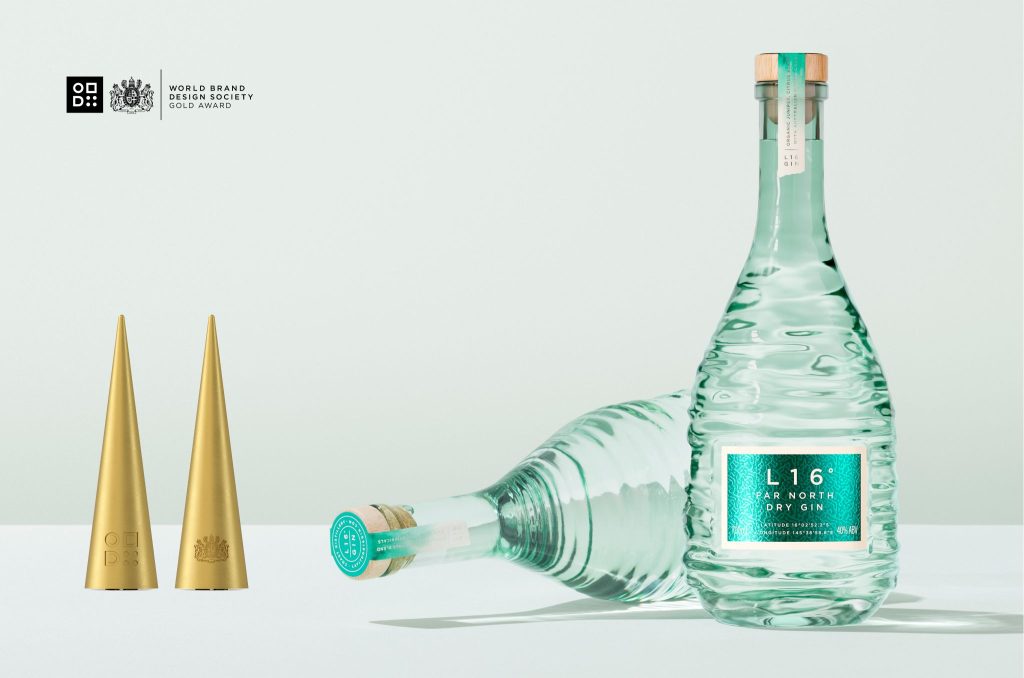
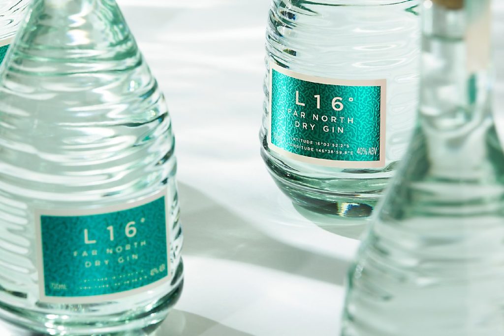
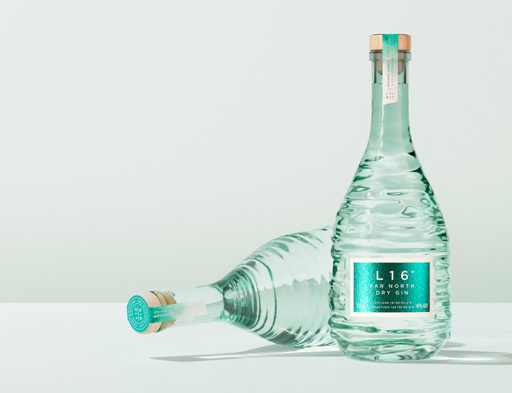
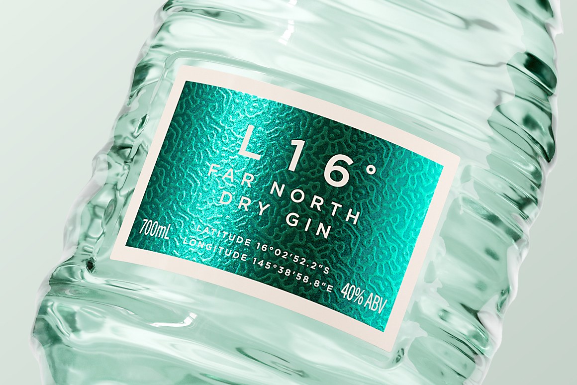
At the heart of the design is the label’s coral sea pattern: a refined visual signature that balances delicacy with strength. It’s not decoration for decoration’s sake — it’s sensory storytelling. As the bottle turns in hand, the pattern creates depth and movement, echoing the refracted light and texture of shallow reef water in a way that feels modern, tactile, and unmistakably L16°.
Clay’s design thinking shaped the entire system around that hero moment — the restraint of the typography, the calm confidence of the layout, and the way the graphics and bottle read as one object. The result is premium packaging that doesn’t shout, but commands attention.
This instalment focuses on the creative direction and design decisions. In the next post (#5), we’ll go deeper on how the label system was physically produced and brought to life in partnership with our label manufacturing specialists.
Partner spotlight: Clay Andrews
Stage: Label design & materials
What Clay brought: A restrained, technically layered packaging design that translates reef light and water clarity into typography, colour, and finish — without visual noise.
Clay’s work on L16° Far North Dry Gin was recognised by the World Brand Design Society’s Creative Design Awards 2025/26: he was named Creative of the Year, and the L16° project received Best Creative Work of the Year, selected as a Black Mark Winner AND Gold Mark Winner
Clay secured 11 awards in total across the season, and lists L16° Far North Dry Gin among his most notable works.
Design principle: tell the story through surfaces, not scenery
From the outset, the design intent wasn’t to depict a coastline or botanicals. It was to translate an experience — the optical qualities of shallow reef water: light, clarity, stillness — into a modern system that feels premium and calm.
The award write-up describes the work as “experiential design” — anchored in a precise emotional memory and expressed through how materials and surfaces interact with light.
Hierarchy: clarity first, then discovery
In trade, labels have to work at two distances:
- At shelf distance: brand and product name must read quickly and confidently.
- In hand: the details reward attention — texture, subtle colour transitions, and finish choices that shift as the bottle moves.
For L16, that balance comes from restrained typography and a minimalist structural approach that avoids clutter, letting materials do more of the storytelling work.
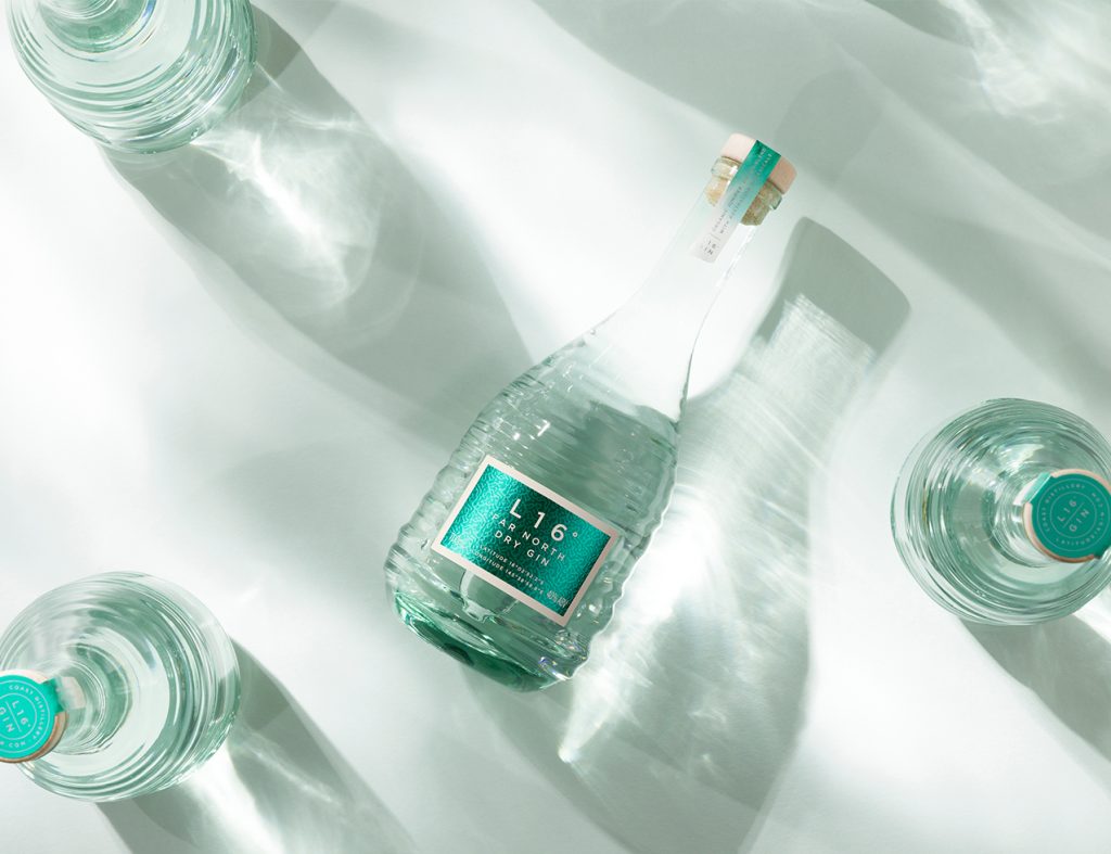
Material intent: light as a “feature”
Material choices were treated as part of the concept, not a final decoration pass. The system was built to create subtle shifts in sheen and reflectivity — so the label feels calm and premium in low light, and comes alive when it catches sun or backbar lighting.
This approach also keeps the brand expression cohesive with the glass: Vert credits Clay with developing the coastal-inspired sleeve and bottle graphics to work with the bottle’s form and evoke “light, colour, and calm.”
Why this matters in trade
When label design is built around clarity and material behaviour, it delivers practical outcomes for trade partners: faster recognition on shelf, stronger premium cues on backbar, and a brand system that stays consistent across channels because it isn’t dependent on busy illustration or trend-led graphics.
Further reading
Clay’s L16° project has been featured by World Brand Design, highlighting the sensory-led approach and the design intent behind the packaging system:
World Brand Design Society Awards
L16° Far North Dry Gin — sensory packaging vision by Clay Andrews
Creative Brands – Latitude 16 Gin: A Coastal Spirit Captured in Glass
Communication Arts – L16 Packaging
Next in the series
From Concept to Shelf: Label Manufacturing & Application — how this label system was produced, tested, and applied for consistent, production-ready results.
Trade enquiries
If you’re interested in stocking our range or discussing trade supply, get in touch via our Trade Enquiries page.