From Concept to Shelf: The Bottle
From Concept to Shelf: The Bottle
In our series opener, we mentioned one of our sustainability goals for Latitude 16: creating a bottle designed to live on beyond its first use — reusable as a water bottle or repurposed as a vase. In this instalment, we’ll share how that intent shaped the bottle itself, and we’ll champion the specialist partner who helped bring it to life.
Because in trade, packaging isn’t decoration — it’s part of performance. A bottle has to look premium on shelf, pour confidently on bar, arrive reliably through distribution, and remain consistent across production runs.
Partner spotlight: Vert Industrial Design House
Stage: Bottle design
What Vert Design brought: Translating the Latitude 16 story into a distinctive, manufacturable glass form with tactile shelf and backbar presence.
Vert has published a detailed project feature on the Latitude 16 bottle design — we recommend reading it for the full creative and production deep dive. We’ll link to it below.
The brief: premium presence, real-world handling
We set out to build a bottle that could carry a coastal, premium identity while meeting the everyday realities of wholesale and hospitality. That meant focusing on the practical details as much as the aesthetics.
- Shelf impact: a silhouette that reads premium at distance
- Backbar performance: comfortable grip and a controlled pour
- Stability: confident footing on shelf, bar, and storage
- Repeatability: detail that can be produced consistently run-to-run
- Longevity: a bottle worth keeping and reusing beyond first use
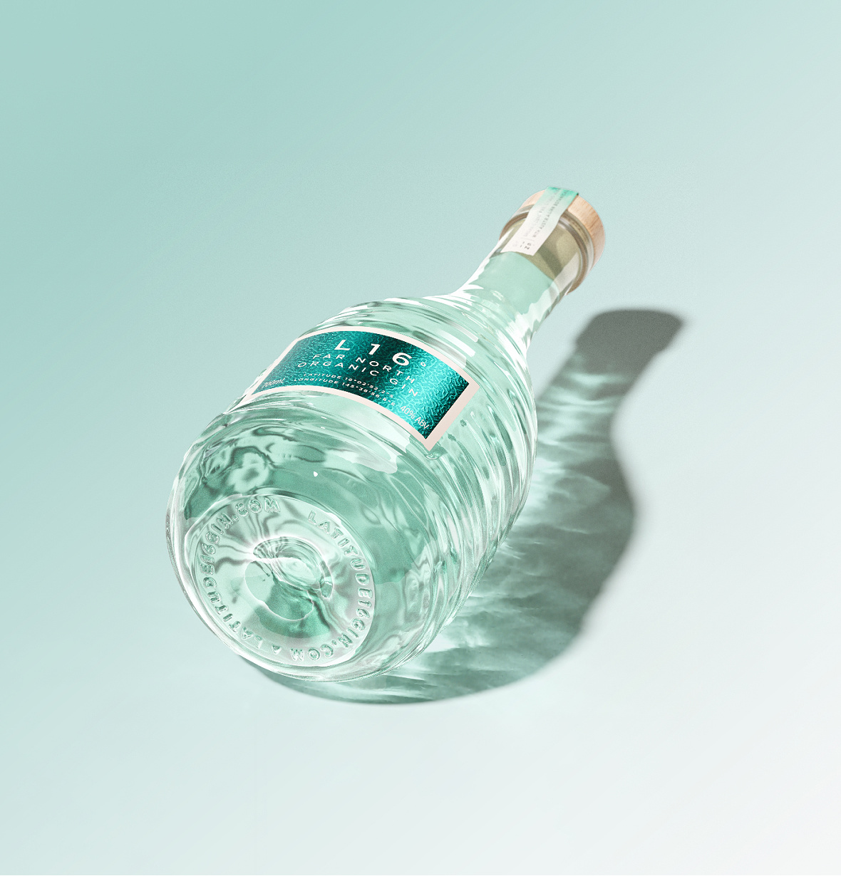
Form: recognisable from across the room
Premium shelf presence starts with proportion. The Latitude 16 bottle was developed to feel refined and modern — distinctive enough to be recognised quickly, but balanced enough to sit comfortably in a premium spirits set.
For trade partners, that matters because the bottle becomes a shorthand for quality before anyone reads the label.
Texture: a tactile signature that also improves handling
The rippled texture isn’t a surface “effect” — it’s a functional and brand-defining decision. It adds tactility and grip (useful in fast service environments) while creating a unique light-catching signature that differentiates the bottle without relying on loud colour or oversized labels.
Glass colour: subtle, coastal, consistent
The subtle green tint was selected to support Latitude 16’s coastal identity while keeping the liquid presentation clean and premium. It’s a quiet cue, but it plays an important role in building a consistent look across retail and hospitality settings.
The base: stability, durability, and finishing detail
Base design is where concept meets practical performance. Stability helps in retail and on bar, and it also supports reliability through distribution and handling. It’s one of those details that often goes unnoticed when it’s done right — but it contributes to the overall sense of quality and confidence.
Why this matters in trade
A bottle is a sales tool and a service tool at the same time. When it looks premium, feels premium, and performs reliably, it supports stronger shelf appeal, backbar confidence, and brand consistency across accounts.
Read Vert’s full design feature
For the full design story — including creative development and production considerations — read Vert’s project feature below:
Latitude 16 Gin — Vert Design (project feature)
Next in the series
From Concept to Shelf: Glass Manufacturing & Colour — how glass moves from creative intent to repeatable production, and what we look for to maintain consistency at scale.
Trade enquiries
If you’re interested in stocking our range or discussing trade supply, get in touch via our Trade Enquiries page.